Summary
- Four of GiveWell’s top charities support deworming—the mass distribution of medicines to children in poor countries to rid their bodies of schistosomiasis, hookworm, and parasites.
- GiveWell’s recommendation relies primarily on research from western Kenya finding that deworming in childhood boosted income in adulthood. GiveWell has also placed weight on a study by Hoyt Bleakley of the hookworm eradication effort in the American South 100 years ago.
- I reviewed the Bleakley study and reach a different conclusion than he did: the deworming campaign in the American South did not coincide with breaks in long-term trends that would invite eradication as the explanation.
- GiveWell research staff took the conclusions of this post into account when updating their recommendations for the 2017 giving season. GiveWell continues to recommend deworming charities.
- I also reviewed a separate Bleakley study of the impacts of malaria eradication in the United States, Brazil, Colombia, and Mexico. My reading there is more supportive. I’m finalizing the write-ups now and will share them soon.
Introduction
After the latest refresh, GiveWell’s list of top charities includes four that support deworming—the mass distribution of medicines to children to rid their guts of certain parasites. Several dozen randomized studies measure the short-term effects of deworming programs (within a year or so) on everything from body weight to being in school.1The 2016 Campbell review finds 52 short-term studies with follow-up duration under five years. Most last one to two years. If intestinal worms were often fatal, then short-term gains against them might be measured in lives saved, which could on its own make a decisive case for deworming. But the symptoms are normally subtler. On the other hand, some research finds that the aftereffects last into adulthood. This is why the long-term effects of deworming dominate GiveWell’s estimates of the cost-effectiveness of charities that support it.
Unfortunately, only a handful of experimental studies assess deworming’s impacts over the long haul, and most of those are based on a single experiment in Kenya. For summaries, see this 2016 post, in the section entitled “The research on the long-term impacts of deworming.” This paucity of experimental evidence has led GiveWell to place weight on a non-experimental, historical study of deworming. Hoyt Bleakley‘s 2007 paper tracks the impacts of the campaign to eradicate hookworm from the American South a century ago.
As part of an ongoing effort to scrutinize the evidence on the long-term impacts of deworming (this, this), GiveWell worked over the past year to revisit the Bleakley study. With huge assists from Christian Smith, Zachary Tausanovitch, and Claire Wang, I have formed a fresh and critical assessment of the evidence. The hookworm eradication effort in the American South did not coincide with breaks in long-term trends that would invite eradication as the explanation. For example, after the eradication campaign, outcomes such as school attendance indeed rose faster for children in historically worm-endemic areas, which could be taken as a sign of success. But that trend began decades before eradication. The full write-up is in this new working paper [revised version].
As John D. Rockefeller, arguably the richest human in history, entered philanthropy just over a century ago, he was persuaded to back large-scale, scientifically informed public health campaigns—not unlike Bill Gates in our era. In 1910, he gave $1 million to create the Rockefeller Sanitary Commission for the Eradication of Hookworm Disease. Across eleven southern states from North Carolina to Texas, the RSC soon launched what today would be called the War on Worms. Drugs were dispensed to treat infected children. Doctors, teachers, and the public were educated about the importance of sanitation, especially the use of proper privies.
From a researcher’s point of view, the suddenness and success of the campaign, and its broad geographic sweep, offer hope for credible impact assessment. If, for example, school attendance rates jumped just as infection rates plunged, that could be a compelling sign of the knock-on effects of mass deworming of children. The Bleakley (2007) study recognizes and exploits this opportunity for impact assessment. Paralleling the modern research out of Kenya, the study finds that after the RSC campaign, children in formerly worm-afflicted areas went to school more (a short-term development) and earned more as adults (a long-term effect).
In this post, I’ll explain how the GiveWell reanalysis of the Bleakley (2007) hookworm research differs from Bleakley’s original. Then I will show you some graphs that tell most of the analytical story.
I have also reviewed the related Bleakley (2010) study of the impacts of malaria eradication in the United States, Brazil, Colombia, and Mexico. There, my conclusion is more positive. I hope to release and blog that review in the next few weeks. Update: done.
What we did
The reanalysis of the Bleakley (2007) hookworm study included the following steps:
- Returning to primary sources to reconstruct the data set. The data and computer code for the study are not publicly available. In correspondence starting a year ago, Hoyt Bleakley stated that they are effectively inaccessible now. Re-gathering the data was a major undertaking because Bleakley culled nearly 50 variables from obscure, century-old books and articles. Some, such as the student-teacher ratio in each county of the eleven southern states, were found in state government reports that varied in completeness and reporting conventions. Christian Smith, Claire Wang, and, especially, Zachary Tausanovitch, poured many hours into this effort.
- Expanding the census data sets. Bleakley (2007) tracks outcomes such as school attendance, literacy, and income using U.S. census data. These come to us not from old books, but from the IPUMS online database. Until recently, all the IPUMS data sets were samples from a given year’s census records, taking, for example, one household from every fifth page of the enumeration. (Here’s a sample page from 1920 with my great-grandparents and family in rows 3–6.) When carrying out this research in 2003–05, Bleakley appears to have used the biggest sets then available, such as the 1-in-250 sample from the 1910 census and the 1-in-100 sample from 1920. No data were then to be had from 1930. The GiveWell reanalysis takes advantage of the newer, bigger samples, including preliminary 100% samples for 1910–40. In aggregate, the new data set is about 100 times larger than that in Bleakley (2007).
- Copying choices from one Bleakley (2007) table or figure to another. For example, one table in the paper estimates impacts on school enrollment, school attendance, and literacy. A corresponding figure, discussed soon, only depicts impacts on attendance. In the new paper, I rerun the figure for all three outcomes.
- Imposing an arguably tougher standard for proof of impact. I concur with Bleakley that after the eradication campaign swept through the South in 1911–14, prospects improved disproportionately for children born in areas historically prone to hookworm. This catch-up, or convergence, surfaces in the data whether comparing counties within the South (low-lying counties tended to have more hookworm than mountainous ones), or comparing southern states to other states. But that observation alone leaves me unconvinced that ridding children’s bellies of hookworm was the cause. What if the trend began well before eradication or continued well after? I therefore focus on this question: Did convergence temporarily accelerate in tandem with eradication? The Bleakley (2007) tables and figures do not approach this question so aggressively.
We shared drafts of the paper and this post with Hoyt Bleakley. This did not yield any additional insight into why our analysis differs from the original.
The short-term impact on schooling
The figure below, adapted from one edition of the Bleakley study, illustrates the finding that I just mentioned, that after eradication, school attendance surged among kids living where hookworm had been common.2Versions of Bleakley (2007) appeared in the Quarterly Journal of Economics, a World Bank report, and the site of the National Center for Biotechnology Information. They are nearly the same. I will convey the gist of the figure first, then explain it more precisely. You can see that the central red line stays essentially flat from 1870 to 1910. Then it jumps to about zero between 1910 and 1920, census years bracketing the Rockefeller campaign. Thereafter, the red line mostly again holds steady. The one-time jump looks like a fingerprint of eradication.
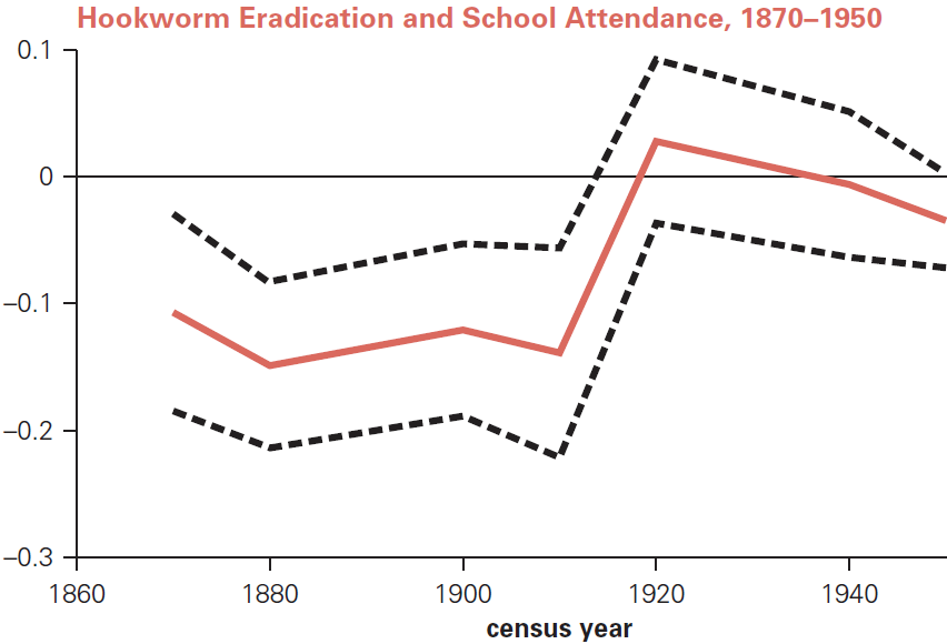
What does the red line mean exactly? For each census round with available data between 1870 and 1950, Bleakley (2007) computes the association within Southern counties between the school attendance rate of 8–16-year-olds and the hookworm infection rate as measured at the start of eradication, circa 1910.3The regressions for each census year control for the interactions of sex and race on the one hand and age on the other. They do not include the other Bleakley (2007) controls. Samples are restricted to eleven Southern states. The unit of observation is the State Economic Area, which is an aggregation of several counties. That the red line starts around –0.1 in 1870 means that on average, if a county’s child hookworm infection rate was 10 percentage points higher when measured around 1910, its school attendance rate in the 1870 census was 1 percentage point lower. More plainly, counties with more worms in kids had fewer kids in school. But between the 1910 and 1920 censuses, that bad-news association abruptly faded. As of 1920, a child in a historically high-hookworm county was no less likely to be in school. The black, dashed lines show confidence intervals for these census-by-census estimates—probably 95% confidence, but I cannot tell for sure.
Here is the best replication of that graph using the reconstructed data and code. I have drawn it differently to emphasize that we only have data from certain decennial censuses, and to depict the gradations of confidence within the 95% confidence intervals.4The 1890 census records were destroyed in a fire. 1930 records had not been digitized at the time Bleakley did this work.
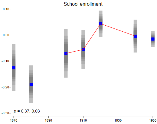
I discern a resemblance between the original graph and the reconstruction. In both, school enrollment rises especially quickly between 1910 and 1920 and then declines slightly. But there is a difference too, and it is more than cosmetic. Now it appears that children in hookworm-infested areas gained substantially on school attendance not just between 1910 and 1920 but between 1880 and 1900 as well—and maybe throughout 1880–1910. For lack of access to Bleakley’s data and code, I cannot explain the discrepancy between this reconstruction and the original. There could be an error in the new or the old, or some subtle difference in data or method.
The new graph’s ambiguous mix of confirmation and contradiction forces a question that is at once conceptual and practical. How do we systematically judge whether the signal of hookworm eradication is present amidst the noise of other influences? To what degree does the new graph confirm or contradict the old?
I think there is no one best way to answer that question. One approach that I took is depicted with the red lines in the reconstructed graph above, and in the p values in the bottom-left corner. I drew the red lines to connect the dots that surround the eradication campaign. I wanted to quantify how much the red contour bends upward in 1910 and downward in 1920—as in Bleakley’s graph—and with what statistical significance. That is: Suppose the education gains took place at a constant pace between 1900 and 1940 with no acceleration around the campaign in the early 1910s. (I would have substituted 1930 for 1940 were 1930 data available in this graph.) What is the chance that we would see as much bending in the red line as we do? The computer says that for the upward kink at 1910, the answer is 0.37, which is not very low. On the other hand, the deceleration around 1920 is quite hard to ascribe to pure chance, at p = 0.03. Still, the new graph casts doubt on the proposition that the campaign brought a big break with the past.
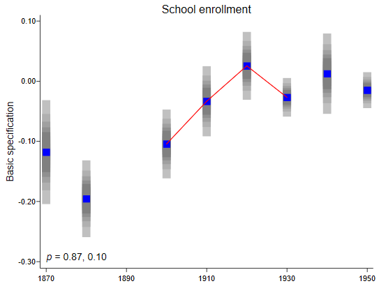
Having settled on an analytical approach, the next step was to add all the census data that has been digitized since Bleakley did his work. This brings an obvious change (see below; now that 1930 data are included, I extend the third red line only that far). Now it looks far more as though the high-hookworm parts of the South began closing the schooling gap with low-hookworm parts around 1880, some 30 years before the hookworm campaign:
In a final test, I recomputed the graph while incorporating all the Bleakley (2007) control variables. Hookworm eradication was hardly a clean experiment, in the sense that the geographic reach of the disease was not random going in. The South had it more than the rest of the country; within the South, the coastal plains had it most. If the beneficiaries of eradication differed systematically from the rest before eradication, they could continue to differ after for reasons having little to do with hookworm prevention, creating a false appearance of impact. Striving to statistically remove such initial differences, Bleakley (2007) introduces into some of the regressions an aggressive set of controls. They relate to education, health, agriculture, and race. The paper includes these controls in some of the schooling regressions reported in a table, but does not bring them to the schooling graph shown above. It turns out that doing so (in our expanded-data graph) removes most signs of any long-term gains:
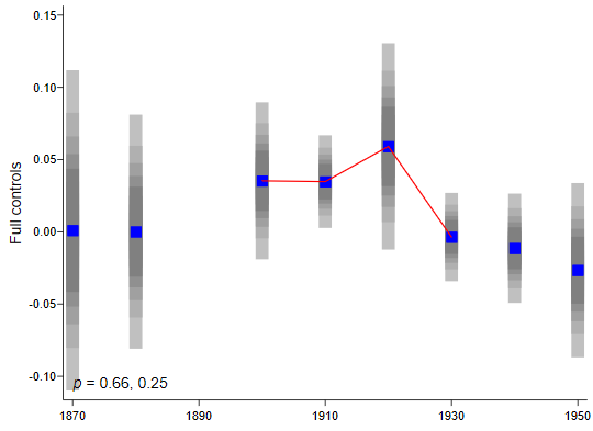
The lack of upward trend here does not mean that the historically hookworm-burdened parts of the South did not after all close a schooling gap between 1880 and 1920. It does suggest that the closure was correlated with, and therefore potentially caused by, the non-hookworm factors that Bleakley sometimes controls for.5Consistent with this graph, while the Bleakley (2007) full-controls regressions continue to put a statistically significant coefficient on the treatment proxy, the reconstructions do not. This is one of the few cases where the original results are not recognizable in the reconstruction. See Table 6, panel B, of the new paper.
In sum, I do not see robust evidence that schooling and literacy improved at an historically anomalous rate circa 1910, in a way naturally attributable to hookworm eradication.
The long-term impact on earnings
What the first half of the Bleakley (2007) study does for short-term impacts on schooling, the second does for long-term impacts on earnings. Here too, the conclusion is encouraging. “Long-term follow-up,” writes Bleakley, “indicates a substantial income gain as a result of the reduction in hookworm infection.” This finding resonates strongly with the GiveWell cost-effectiveness analysis, which makes a key assumption about how much deworming children boosts future income. The number we use for that impact comes from modern, experimental research in Kenya; yet Bleakley’s inference from American history had boosted our confidence in the Kenya number. (That said, GiveWell has discounted the Kenya number by 80–90% out of fear that it won’t replicate to other settings.6See the “Replicability adjustment for deworming” row of the “Parameters” tab of the cost-effectiveness analysis spreadsheet.)
The Bleakley (2007) graph I will focus on draws together data from censuses as ancient as 1870 and modern as 1990. One problem with measuring impacts on income over this span is that not until 1940 did Census takers begin asking people how much money they made. For this reason, the IPUMS census database provides proxies for income that reach back farther. One is the occupational income score (OIS), which is, approximately speaking, the average income in 1950 associated with a person’s census-reported profession. Thus, if lawyers averaged $10,000 in income in 1950, then any self-described lawyer between 1870 and 1990 is taken to earn that much. The OIS is expressed in hundreds of dollars of 1950, and is an example of an index of “occupational standing.”
Before scrutinizing the evidence of long-term impacts on occupational standing, I need to describe a twist that Bleakley (2007) introduces in moving from short- to long-term. As one tries to follow people over longer periods of time, the analytical tack that Bleakley took for schooling starts to break down. For it looks at how the people in given places fared over time. The problem is that sometimes people move—across the state or across the country. And in this analytical set-up, the researcher does not follow them. If deworming gave children in coastal Georgia more agency in life—better health, more education—perhaps they exercised that agency by moving to Atlanta. If we only looked at the incomes of the people who stayed behind, we would miss the full story.
To minimize this attrition from migration, in studying long-term impacts, Bleakley (2007) groups census records not by place of residence at the time of census, but by place of birth. Then, if a person was born in Georgia in 1915, showed up in the census in 1940 as a bricklayer in Atlanta, in 1950 as a general contractor in Lexington, and in 1960 as the manager of a construction company in Phoenix, all three census records would be associated with Georgia in 1915. After organizing the data this way, Bleakley (2007) could study whether children born in certain areas after eradication went on to earn more than those born in the same places before eradication.
Reorganizing the data this way generates two ripple effects. First, while census takers record place of residence with extreme precision, they only record place of birth by state. We cannot differentiate people by whether they were born in hookworm-prone areas within, say, Mississippi. We can only differentiate by whether they were native to a historically high-hookworm state such as Mississippi or a low-hookworm one such as Michigan. Thus, while the short-term analysis compares counties within 11 southern states, the long-term analysis compares states across the continental U.S.
The second ripple effect is that the data come to us at higher temporal resolution: by birth year, not census decade. In response, Bleakley (2007) hypothesizes that how much hookworm depressed adult earnings depended on the percentage of one’s childhood spent where it was endemic. If we take eradication to have occurred in 1910 and assume with Bleakley (2007) that childhood lasts 19 years, then babies born in or before 1891 would have reached adulthood before eradication, too soon to benefit. Babies born in endemic areas in 1892 would have been helped for one year (between their 18th and 19th birthdays); in 1893 for two; and so on. Those born in 1910 or later stood to reap the full 19 years of benefit. Bleakley (2007) therefore hypothesizes that the impact of eradication follows a sort of diagonal step shape with respect to birth year. The step starts rising in 1891 and stops in 1910. Bleakley depicted that contour with dashed lines in this figure:
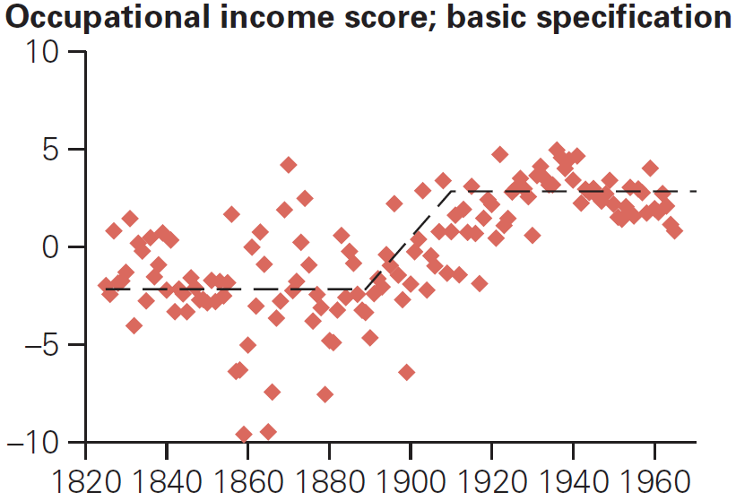
As you can see, Bleakley (2007) fit this contour to data, to see how well it could explain historical patterns. These dots are derived much as in the earlier Bleakley (2007) figure. For example, the leftmost dot is for the year 1825, and has a vertical coordinate of about –2. That means that among people born in 1825, being native to a state whose hookworm infection rate circa 1910 was 10 percentage points (0.1) higher corresponded to having an Occupational Income Score 0.20 lower. That means $20/year less income throughout adulthood, in the dollars of 1950. The graph shows that this association was generally negative in the mid-19th century and generally positive after 1910: formerly, coming from a hookworm zone depressed lifetime earnings. And the graph suggests that the transition followed the step pattern expected if the cause was hookworm eradication.
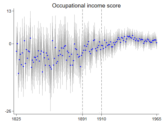
Below is my best reproduction of that graph. As before, I have plotted both the dots and their 95% confidence intervals. I have avoided superimposing the step-like contour the way Bleakley (2007) does because I worry that it tricks the eye into believing that the contour fits the data better than it really does. But I have marked the years when the contour kinks, 1891 and 1910:
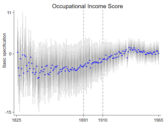
Here is the same graph when using the 100-times-bigger census data sets now available7In addition to adding data, this version mimics the rest of the Bleakley (2007) analysis in adding blacks and in fitting directly to census microdata rather than aggregates, in order to include controls for race, sex, and their interaction.:
And here is the graph when I copy Bleakley (2010) in incorporating all the controls for cross-state differences in health and health policy, education policy, and other traits8As I noted, when looking at short-term impacts on education, Bleakley (2007) does not plot a graph while incorporating all controls. But now, when looking at long-term impacts on occupational standing, Bleakley (2007) does also include such a graph. See the bottom right of this figure.:

Does it look to you like the upward trends in these last two graphs accelerated around 1891 and decelerated around 1910, as predicted by the Bleakley (2007) theory? To me, I have to say, not much. The climbs look steady and longer-term.
Since “not much” is muddy, I moved once again to formalize my interpretation. In analogy with my earlier graphs for schooling, I fit lines to the data points in the 19 years between 1891 and 1910, as well as to the 19 years on either side. Then I checked whether any bending in 1891 and 1910 is statistically significant. The final two graphs fit lines to the dots in the previous two. The dots in these next graphs are the same as in the previous two. It doesn’t look that way because I erased the grey confidence bars in order to expand the vertical scales.


In the both graphs the trend looks quite straight over the three generations surrounding the eradication campaign. The p values, shown in the bottom-right of each plot, are high.
Conclusion
Reanalyzing the Bleakley (2007) study left me unconvinced that the children who benefited from hookworm eradication went to school more or earned more as adults. Conceivably, if I had access to the original data and code, the confrontation with the reconstructed versions would expose errors in the the new version that would alter my view. But this seems unlikely. The new census data sets are much bigger than the old, which improves precision. And most of the differences probably do not arise from clear-cut errors on either side, but from minor differences in implementation, such as taking education spending from a different edition of an annual government report. If the conclusions swing on such modest and debatable discrepancies, then they are not robust and reliable.
Finally, even if the two versions of the data matched exactly, I might still disagree on interpretation, since I use tests, illustrated above, that focus more exclusively on whether the time trends contain the temporal fingerprint of hookworm eradication. For me, that fingerprint is characterized not merely by once-high-hookworm areas catching up with low-hookworm ones, but catch-up that accelerates and decelerates at times that fit the timing of the eradication campaign.
The data and code for this study are here (640 MB). The full write-up is here [revised version].
Notes
| ↑1 | The 2016 Campbell review finds 52 short-term studies with follow-up duration under five years. Most last one to two years. |
|---|---|
| ↑2 | Versions of Bleakley (2007) appeared in the Quarterly Journal of Economics, a World Bank report, and the site of the National Center for Biotechnology Information. They are nearly the same. |
| ↑3 | The regressions for each census year control for the interactions of sex and race on the one hand and age on the other. They do not include the other Bleakley (2007) controls. Samples are restricted to eleven Southern states. The unit of observation is the State Economic Area, which is an aggregation of several counties. |
| ↑4 | The 1890 census records were destroyed in a fire. 1930 records had not been digitized at the time Bleakley did this work. |
| ↑5 | Consistent with this graph, while the Bleakley (2007) full-controls regressions continue to put a statistically significant coefficient on the treatment proxy, the reconstructions do not. This is one of the few cases where the original results are not recognizable in the reconstruction. See Table 6, panel B, of the new paper. |
| ↑6 | See the “Replicability adjustment for deworming” row of the “Parameters” tab of the cost-effectiveness analysis spreadsheet. |
| ↑7 | In addition to adding data, this version mimics the rest of the Bleakley (2007) analysis in adding blacks and in fitting directly to census microdata rather than aggregates, in order to include controls for race, sex, and their interaction. |
| ↑8 | As I noted, when looking at short-term impacts on education, Bleakley (2007) does not plot a graph while incorporating all controls. But now, when looking at long-term impacts on occupational standing, Bleakley (2007) does also include such a graph. See the bottom right of this figure. |
Comments
David Roodman, have you ever seen adults and children with hookworm? Why not do something constructive and do a comparaitve study of people with/without hookworm. See
https://www.theguardian.com/us-news/2017/sep/05/hookworm-lowndes-county-alabama-water-waste-treatment-poverty
Comments are closed.