This is the third post in a series about geomagnetic storms as a global catastrophic risk. A paper covering the material in this series was just released.
My last post examined the strength of certain major geomagnetic storms that occurred before the advent of the modern electrical grid, as well as a solar event in 2012 that could have caused a major storm on earth if it had happened a few weeks earlier or later. I concluded that the observed worst cases over the last 150+ years are probably not more than twice as intense as the major storms that have happened since modern grids were built, notably the storms of 1982, 1989, and 2003.
But that analysis was in a sense informal. Using a branch of statistics called Extreme Value Theory (EVT), we can look more systematically at what the historical record tells us about the future. The method is not magic—it cannot reliably divine the scale of a 1000-year storm from 10 years of data—but through the familiar language of probability and confidence intervals it can discipline extrapolations with appropriate doses of uncertainty. This post brings EVT to geomagnetic storms.
For intuition about EVT, consider the storm-time disturbance (Dst) index introduced in the last post, which represents the average depression in the magnetic field near the equator. You can download the Dst for every hour since 1957: half a million data points and counting. I took this data set, split it randomly into some 5,000 groups of 100 data points, averaged each group, and then graphed the results. Knowing nothing about the distribution of hourly Dst—does it follow a bell curve, or have two humps, or drop sharply below some threshold, or a have long left tail?—I was nevertheless confident that the averages of random groups of 100 values would approximate a bell curve. A cornerstone of statistics, the Central Limit Theorem, says this will happen. Whenever you hear a pollster quote margins of error, she is banking on the Central Limit Theorem.
It looks like my confidence was rewarded:
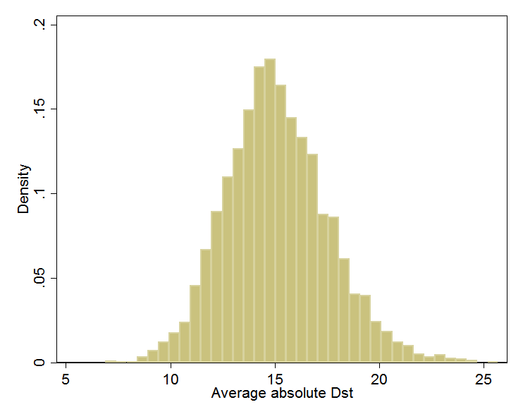
(Dst is usually negative. Here, I’ve negated all values so the rightmost values indicate the largest magnetic disturbances. I’ll retain this convention.)
Bell curves vary in their center and their spread. This one can be characterized as being centered at 15 nanotesla (nT) and having about 95% of its area between 10 and 20. In a formal analysis, I would find the center and spread values (mean and variance) for the bell curve that best fit the data. I could then precisely calculate the fraction of the time when, according to that fitted bell, the average of 100 randomly chosen Dst readings is between, say, 15 and 20 nT.
What the Central Limit Theorem does for averages, Extreme Value Theory does for extremes, such as 100-year geomagnetic storms and 1000-year floods. For example, if I had taken the maximum of each random group of 100 data points rather than the average, EVT tells me that the distribution would have followed a particular mathematical form, called Generalized Extreme Value. It is rather like the bell curve but possibly skewed left or right. I could find the curve in this family that best fits the data, then trace it toward infinity to estimate, for example, the odds of the biggest out of a 100 randomly chosen Dst readings exceeding 589, the level of the 1989 storm that blacked out Québec.
EVT can also speak directly to how fast the tails of distributions decay toward zero. For example, in the graph above, the left and right tails of the approximate curve both decay to zero. What matters for understanding the odds of extreme events is how fast the decline happens. It turns out that as you move out along a tail, the remaining section of tail usually comes to resemble to some member of another family of curves, called Generalized Pareto. The family embraces these possibilities as special cases:
- Finite upper bound. There is some hard maximum. For example, perhaps the physics of solar activity limit how strong storms can be.
- Exponential. Suppose we define a “storm” as any time Dst exceeds 100. If storms are exponentially distributed, it can happen that 50% of storms have Dst between 100 and 200, 25% between 200 and 300, 12.5% between 300 and 400, 6.25% between 400 and 500, and so on, halving the share for each 100-point rise in storm strength. The decay toward zero is rapid, but never complete. As a result, a storm of strength 5000 (in this artificial example) is possible but would be unexpected even over the lifetime of the sun. Meanwhile, it happens that the all-time average Dst would work out to 245.[1]
- Power law (Pareto). The power law differs subtly but importantly. If storms are power law distributed, it can happen that 50% of storms have Dst between 100 and 200, 25% between 200 and 400, 12.5% between 400 and 800, 6.25% between 800 and 1600, and so on, halving the share for each doubling of the range rather than each 100-point rise. Notice how the power law has a fatter tail than the exponential, assigning, for instance, more probability to storms above 400 (25% vs. 12.5%). In fact, in this power law example, the all-time average storm strength is infinite.
Having assured us that the extremes in the historical record almost always fall into one of these cases, or some mathematical blend thereof, EVT lets us search for the best fit within this family of distributions. With the best fit in hand, we can then estimate the chance per unit time of a storm that exceeds any given threshold. We can also compute confidence intervals, which, if wide, should prevent overconfident prognostication.
In my full report, I review studies that use statistics to extrapolate from the historical record. Two use EVT (Tsubouchi and Omura 2007; Thomson, Dawson, and Reay 2011), and thus in my view are the best grounded in statistical theory. However, the study that has exercised the most influence outside of academia is Riley (2012), which estimates that “the probability of another Carrington event (based on Dst < –850 nT) occurring within the next decade is ~12%.” 12% per decade is a lot if the consequence would be catastrophe.
“1 in 8 Chance of Catastrophic Solar Megastorm by 2020” blared a Wired headline. A few months after this dramatic finding hit the world, the July 2012 coronal mass ejection (CME) missed it, eventually generating additional press (see previous post). “The solar storm of 2012 that almost sent us back to a post-apocalyptic Stone Age” (extremetech.com).
However, I see two problems in the analysis behind the 12%/decade number. First, the analysis assumes that extreme geomagnetic storms obey the fat-tailed power law distribution, which automatically leads to higher probabilities for giant storms. It does not test this assumption.[2] Neither statistical theory, in the form of EVT, nor the state of knowledge in solar physics assures that the power law governs geomagnetic extremes. The second problem is a lack of confidence intervals to convey the uncertainty.[3]
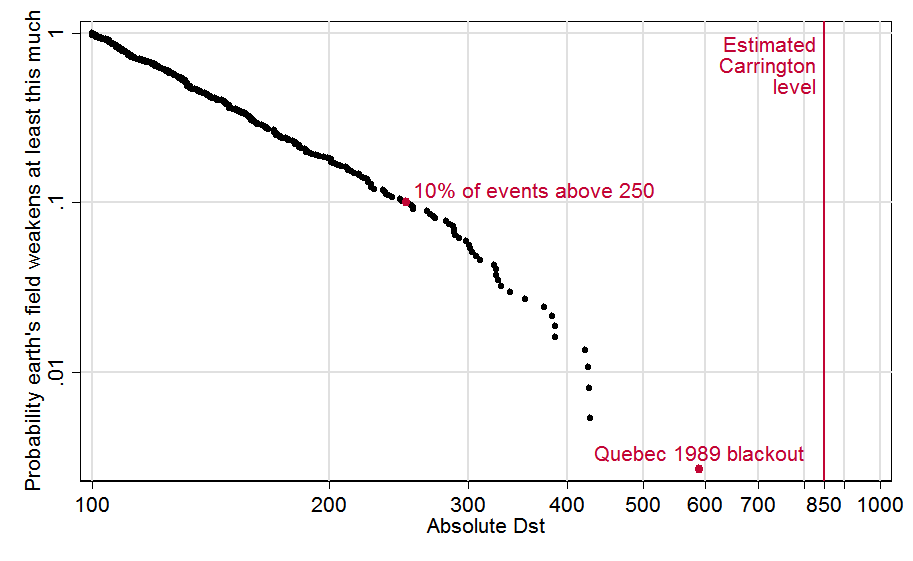
To illustrate and partially correct these problems, I ran my own analysis (and wrote an EVT Stata module to do it). Stata data and code are here. Copying the recipe of Tsubouchi and Omura (2007), I define a geomagnetic storm event as any observation above 100 nT, and I treat any such observations within 48 hours of each other as part of the same event.[4] This graph depicts the 373 resulting events. For each event, it plots the fraction of all events its size or larger, as a function of its strength. For example, we see that 10% (0.1) of storm events were above 250 nT, which I’ve highlighted with a red dot. The biggest event, the 1989 storm, also gets a red dot; and I added a line to show the estimated strength of the “Carrington event,” that superstorm of 1859:
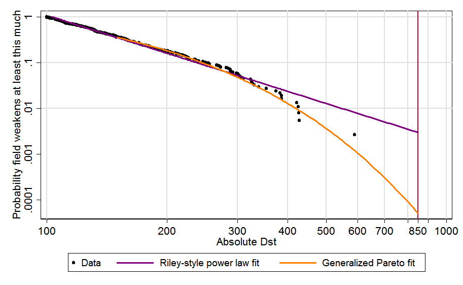
To the left of about 300, the data seem to follow a straight line. Since both axes of the graph are logarithmic (with .01, .1, 1 spaced equally) it works out that a straight line here does indicate power law behavior. However toward the right side, the contour seems to bend downward.
In the next graph, I add best-fit contours. Copying Riley, the purple line is fit to all events above 120; as just mentioned, straight lines correspond to power laws. Modeling the tail with the more flexible, conservative, and theoretically grounded Generalized Pareto distribution leads to the orange curve.[5] It better fits the biggest, most relevant storms (above 300) and when extended out to the Carrington level produces a far lower probability estimate:
Finally, I add 95% confidence intervals to both projections. Since these can include zero, I drop the logarithmic scaling of the vertical axis, which allows zero to appear at the bottom left. Then, for clarity, I zoom in on the rightmost data, for Dst 300 and up. Although the black dots in the new graph appear to be arranged differently, they are the same data points as those above 300 in the graph above[6]:
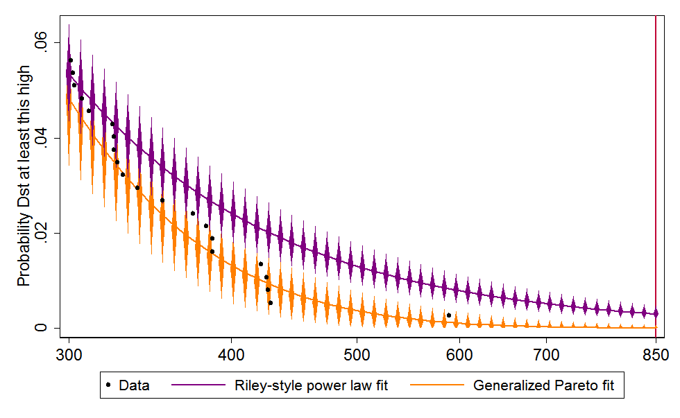
The Riley-style power law extrapolation, in purple, hits the red Carrington line at .00299559, which is to say, 0.3% of storms are Carrington-strength or worse. Since there were 373 storm events over some six decades (the data cover 1957–2014), this works out to a 17.6% chance per decade, which is in the same ballpark as Riley’s 12%. The 95% confidence interval is 9.4–31.8%/decade 11.8–27.7/decade [switched from Wald to bootstrapped confidence interval]. In contrast, the best fit rooted in Extreme Value Theory, in orange, crosses the Carrington line at just .0000516, meaning each storm event has just a 0.005% chance of reaching that level. In per-decade terms, that is just 0.33%, with a confidence interval of 0.0–4.0%.[7]
The central estimate of 0.33%/decade does look a bit low. Notice that the rightmost dot above, for 1989, sits toward the high end of the orange diamonds marking the 95% confidence interval: my model views such a large event as mildly improbable over such a short time span. Moreover, if 0.33%/decade is the right number, then there was only about a 20×0.33% = 6.6% chance of Carrington-scale event in the 20 decades since the industrial revolution—and yet it happened.
Nevertheless, the 95% confidence interval of of 0.0–4.0% easily embraces both big storms. I therefore feel comfortable in viewing Riley’s 12%/decade risk estimate as an unrepresentative extrapolation from history. The EVT-based estimate is better grounded in statistical theory and comes from a model that better fits the data.
So are we in the clear on geomagnetic storms? As I wrote last time, I don’t think so. The historical record exploited here spans less than six decades, which is approximately nothing in solar history. We should not assume we have seen most of what the sun can send our way. There are many limitations in this analysis. As noted in the last post, the Dst index is an imperfect proxy for the degree of rapid magnetic change at high latitudes that may most threaten grids. Though a careful estimate, 850 might be the wrong value for the Carrington event.
And the higher end of the confidence interval, 4%, is worth worrying about if another Carrington could mean a long-term, wide-scale blackout.
Next post in this series.
Footnotes
[1] With a minimum value of 100 and decay constant of ln 0.5, the average of the distribution is 100×(1–1/ln 0.5).
[2] Ruzmaikin, Feynman, and Stoev (2011) check for power law behavior in the speed of CMEs as they leave the sun. They find it between speeds of 700 and 2000 km/sec, but not for the fastest CMEs, which cause the strongest storms.
[3] Stephen Parrott (2014, 2015) highlights several additional ambiguities in Riley (2012).
[4] In fact Tsubouchi and Omura (2007) do not follow their own recipe, treating all ≥100nT observations as distinct events regardless of temporal spacing. This was revealed by their sample sizes and confirmed by e-mail from the authors.
[5] The Generalized Pareto distribution was fit to all events above 150. This threshold was selected by examining a mean residual life plot per the procedure of Coles (2001), §4.3.1. Update, July 21, 2015: Confidence intervals are between percentiles 2.5 and 97.5 except when percentile 2.5 is 0, the theoretical floor, which becomes a mass point at high Dst values. In that case, the reported CI would really be the 0–97.5% interval, wider than intended. So then the 0–95 CI is used instead.
[6] This graph was updated on July 21, 2015 to reflect the change described in the previous footnote.
[7] Per-event rates are converted to per-decade ones according to 1–(1–x)^(N/T), where x is the per-event rate, N is the number of events in the sample (373) and T is the number of decades (5.7735). The confidence interval for the power law projection are conventionally computed, using the delta method and covering the range from 2.5 to 97.5 percentiles. The confidence interval for the GP fit is bootstrapped with 1,000 replications; since many of the bootstrapped projections hit the 0 limit, the confidence interval is constructed from the 0th to 95th percentiles. The central estimate of 0.33% is the median of this distribution. Update, October 23, 2015: The confidence interval for the power law fit is now bootstrapped in the same way.
Comments
David, your final graph showing the error bars on the fits seems strange to me. I understand why the lower 5% confidence bound can be zero: that means you estimate >5% confidence that the true distribution is bounded with a sufficiently low upper bound (lower than the x value). But you show that already happening for x (absolute Dst) values as low as ~425! Shouldn’t that be logically impossible, since you actually have an observation that’s much higher than that (the Quebec storm at 589)?
It’s also strange to me that the power law (purple) error bars are way above the generalized fit (yellow) error bars in the tail. Of course, it’s tautological that the yellow curve is a better fit than the purple fit, since the latter is drawn from a 1 parameter subfamily of the 3 parameter family for the former (I might have the numbers wrong, but the point stands). Even allowing for that, visually it does look to me like the generalized model fits better than the power law (at least ignoring the Carrington event). So the power law fit looks high in the tail, but it doesn’t look crazy to me (as the yellow error bars suggest).
Hi Colin. This is a great question, which I hadn’t thought about. Your question is not about the best fit—the orange line—but about the confidence intervals around it. There are several ways to construct them, none of them perfect…or at least none of them perfect in finite samples.
I constructed them through “bootstrapping.” From the 67 data points graphed above, I had the computer draw 1000 random samples, each of which also had size 67, so there was sampling “with replacement.” For each of these samples, I reran the EVT fit, and calculated the predicted probabilities for events of various sizes. Then for each size, I picked bounds that embraced 95% of cases. Now, it is possible for a Generalized Pareto distribution to be zero above some value (see blue line in this graph.). So in many of the 1000 simulated cases, the instance of 589 (in 1989) and/or other high instances were left out of the sample, making it easier for the best-fit curve to predict zero probability above some storm strength. (Power laws can never do that.) If I had had 67000 extreme observations instead of 67 to work with, this wouldn’t have happened nearly so often, since really big storms would have been present in essentially all the 1000 samples. So what we’re seeing is a small-sample imperfection in the method.
Is that bit of unrealism greatly throwing off the interpretation? I think probably not. I just tried a more classical, non-simulation-method to estimate the error bar at 589 (delta method). Instead of the range 0.00% — 0.26%, I got –0.12% — 0.25%. That’s about the same, except even more unrealistic in principle because it allows for a negative probability!
Basically, I think the “true” confidence intervals would look about the same. They would come close to zero but never quite hit it, at least not until moving to storms stronger than any in the data set. On a graph scaled like the one above, the confidence intervals would still appear to the human eye to crash into the logical minimum of zero, on the low side. So I think we should take the confidence intervals plotted as representative but not quite take them literally.
You are right that the EVT should fit better than the power law just because it has another parameter for flexibility (the comparison is actually 2 parameters to 1 for Generalized Pareto vs. power law, or 3 to 2 if you count the pre-chosen minimum thresholds). So my point is just that Riley’s a priori restriction to the special case does not seem warranted by physics or statistical theory.
–David
Colin, this exchange prompted me to think more about the confidence interval construction for the Generalized Pareto fit (in orange).
For points where 0 is deemed probably enough that the 2.5th percentile is 0, then reporting a confidence interval starting at 0 actually subsumes the entire left tail of the distribution. The confidence interval covers the 0 to 97.5th percentiles, and becomes a 97.5% rather than 95% interval.
For this reason my original graph always used the range [0, 95].
Today, I decided I should *only* make this change when the CI crashes into 0 and otherwise use the standard [2.5, 97.5] range. I have updated the last graph above to reflect this change. The result is that the vertical orange bars are a bit higher on the left half.
But the formal contradiction you pointed out remains: the confidence interval bars near the 1989 storm (Dst=589) still hit zero and imply a non-zero chance that storms that big never happen.
Thanks for this excellent post. Extremely clear and informative.
One thing that still concerns me about the analysis is the fact that it doesn’t fit the observed Carrington event well. You use an extremely rich dataset, but one that doesn’t include this most important data point when trying to predict the probability of Carrington-level events. You note that your model suggests that there was only a 6% chance of observing a Carrington level event, which is not good but not terrible.
Here are a few thoughts on further sanity checking, which might be useful. Instead of using your rich dataset, we can just look at the binary question of whether or not we get a Carrington level event each decade. This is an impoverished set (and throws away all quantitative information) but at least includes the most relevant datapoint. Like your 6% number, it also requires some estimate for how long our observation history is. Like you, I?ll assume that we would have noticed a Carrington level event in the last 20 decades (reasonable numbers here all give similar answers). Our observation is a single event occurring in that time. We then ask for the chance per decade.
The naive estimate is 1 / 20 = 5%
Using the Jeffreys prior we get 1.5 / 21 = 7.1% (my preferred approach)
Using the uniform prior we get 2 / 22 = 9.1%
Another advantage of these methods of estimation is that they are robust to uncertainty about which number of Dst corresponds to the Carrington event.
These estimates are all quite a bit higher than the extreme value theory central estimate of 0.3% per decade and outside its 95% confidence interval, whose upper limit is 4%. In general, I?d go with the extreme value theory answers except for the fact that we know about this Carrington data point and your extreme value theory method does not include it in his dataset and we don?t know how to properly combine our sources of information. My (informal) best guess per decade would thus be somewhere between these: say, 5%.
I wonder whether there are some reasonable methods to stitch together the post 1957 data with the single datapoint of the Carrington event. For example, filling in the missing data with data drawn from your estimated distribution with replacement. This doesn’t sound technically correct, but something like it might still be better than just having a conflict between the estimates from the two unreconciled datasets.
These are good points, Toby. It does seem that more could be done here.
Another incident that might be factored in in some quasi-Bayesian way is the July 2012 near-miss CME, which, as I blogged last time, would have produced a storm with absolute Dst estimated between 480 and 1182. The key determinant within that range would have been the angle of the CME’s magnetic field relative to the earth’s at impact. If we assume the angle would have been uniformly distributed within 0-360 (I don’t know if that’s supported by data), then that induces a distribution on the 480-1182 range. Also we’d want to factor in the ~50% chance that the near-miss would in fact miss.
Such an exercise might be thoroughly anti-Bayesian in that it does not just take the observed data as given…
I wonder if your idea of extending the data set back to 1859 with resampling would be equivalent to adding the 1859 data point, but with a fractional weight reflecting the fraction of the last ~200 years included in the Dst data set.
One might also explore the aa index, which goes back to 1868, and is based on data from two antipodal observatories, one in Australia and one I think in the UK. It is an oddly constructed index from my point of view, inherently bounded above. There may be a good reason no one has used it to study extreme storm frequencies. I have the data set in useful form.
This and the last post make two points: Carrington wasn’t so much larger than what we’ve experienced in recent decades; and storms of its size are less common than Riley suggests. These points are in tension, since the less exceptional is the Carrington event, the more often we must see storms like it. To my mind, the first point is stronger in evidence and implications.
Hello,
I have found your series of posts on extreme space weather events. Are there any more posts in the series?
Abby, there is a link to the series at the top of this post.
Thank you for you response. I should have been more clear. I meant will there be any more than the three posted as of now or is this the last post in the series?
Yes, Abby. Two more are on the way.
David, sorry for the (very) slow reply. Some further comments:
– My bad on the number of parameters, thanks.
– I had a look at Riley (2012) to see if he had a good reason for the more restrictive power law assumption on the tail distribution. Apparently not; his explanation of why he uses (restricts to) the power law form seems pretty hand-wavy. In fact, though he cites Tsubouchi and Omura (2007), it looks like Riley doesn’t even note that they are not using a power law. So there doesn’t seem to be a compelling a priori reason to restrict the tail distribution as Riley did.
– I don’t think it makes sense to use a non-standard definition of the confidence interval: it can happen that the [2.5,97.5] interval covers the same set of values as the [0,97.5] interval (because the left tail is constant), but so be it. (As an aside, the new definition would have bad continuity properties for the left tail very close to constant.)
– The lower confidence interval caught my eye because of the logical issue, but it’s the upper confidence interval that we really care about; intuitively/visually it just looks too low to me.
– I’m not remotely expert on this stuff, but I think of the virtue of the bootstrap method is its generality: you can apply it even on non-parametric distributions. But since you have an explicit parametric family, is it possible to do a Bayesian analysis to get a density on the (two-parameter) space of possible distributions? From there you can compute the confidence interval. (I don’t think that’s equivalent to computing the confidence interval from the ML distribution.) I guess a key problem is what prior density you start with on the family of possible tail distributions.
Hi Colin,
Sorry I’ve also been slow to reply. I just overhauled the code that creates the last graph, the one you comment on. The visible change is subtle, but I think it deals much more effectively with the challenge of rendering these unusual confidence intervals. The CIs are now shown in the way you want, in effect, but in way that also conveys the distribution within the 95% bounds. I think this gets us out of the trap of choosing the “right” bounds, since any bound is arbitrary.
As for Bayesian analysis: no doubt it can be invoked here. See Toby Ord’s comments above. I don’t personally have time to get into that now though. Maybe Toby will carry it forward.
–David
Thanks David. I’ve never seen this representation of CI’s before, looks great. It conveys significantly more information, does not look cluttered (to my eye anyway) and is very intuitive.
Re Toby’s — and your — excellent interchange: I saw that. But my comment was about something different. At a high level: Toby was asking about adding the Carrington event to the data set in some way (and you discussed potentially adding other data). My intended point was about the methodology on the existing data set. (I just thought I’d clarify.)
Comments are closed.