![Mariel_Refugees[1]](https://en.wikipedia.org/wiki/Mariel_boatlift#/media/File:Mariel_Refugees.jpg)
As a consultant for the Open Philanthropy Project last year, I reviewed the research on whether immigration reduces employment or earnings for workers in receiving countries. I concluded that for natives the harm, if any, is small.
Last month the prominent immigration researcher George Borjas posted a challenge to a seminal study in my review. His new paper contends that the Mariel boatlift, which brought some 60,000 Cuban refugees to Miami in 1980, did profoundly affect the labor market there, depressing wages for low-education men (ones with less than a high school education) by 10–30%.
Borjas’s work is especially significant because it seems to upend a study of the boatlift published by David Card 25 years ago, which found little impact of all that immigration on workers in Miami. Interestingly, Borjas, who emphasizes the harm of Cuban immigration, is himself a Cuban emigré.
I probed this dispute, replicating and checking the results in the dueling papers. I ultimately found little cause to change my views. The main reasons:
- Of the two Census Bureau data sets that Borjas relies on, the one with larger samples shows smaller impacts.
- According to that data set, wages for women, which Borjas excludes, rose, if anything, after immigration spikes (especially after a second one in 1994–95).
- I see no sharp breaks from long-term trends of the sort that could be confidently attributed to the 1980 immigration surge. The Borjas analysis appears correct that wages for low-education Miami men (defined henceforth as those with less than a high school education) were lower on average in 1981–83 than in 1977–79—with the drop being larger than in most other US cities. But the data argue more for a steady long-term decline than sudden drops after immigration surges. The Borjas analysis tends to obscure this distinction by aggregating or smoothing data over several years.
- The original study by David Card is one of 17 covered in my review, including three others exploiting natural experiments in mass migration. None of the studies is as compelling as a randomized trial, but the overall picture—of at most modest harm from substantial immigration—does not change if the Card study is removed.
Details follow.
Background
In my evidence review on the impacts of immigration in receiving countries, I wrote:
There is almost no evidence of anything close to one-to-one crowding out by new immigrant arrivals to the job market in industrial countries. Most studies find that 10 percentage point increase in the immigrant “stock” as a share of the labor force changes natives’ earnings by between –2% and +2% (Longhi, Nijkamp, and Poot 2005, Fig 1; Peri 2014, Pg 1). Although serious questions can be raised about the reliability of most studies, the scarcity of evidence for great pessimism stands as a fact. The economies of destination countries largely appear flexible enough to absorb new arrivals, especially given time.
I based that conclusion in substantial part on studies that exploit natural experiments, large and sudden movements of people that have the best hope of making major side-effects of immigration obvious. It was David Card who inaugurated this literature with his 1990 paper on the Mariel boatlift. I tersely summarized that paper this way in a table at the end of my review:
Natural experiment not as perfect as randomized since other events could have offset Boatlift’s effects. But zero change after 7% labor supply spike most easily explained as (non-)impact.
(Earlier on, my review also discusses the paper more fully.)
The great boatlift began in April 1980 when Fidel Castro opened the Cuban port of Mariel for exit. Americans, presumably including many Cuban-Americans, provided the boats. Wikipedia helpfully reviews the local and global events leading to this unusual episode. The major pulse of people came in May and June, and the flow was halted in September. Some 125,000 Cubans came to the US, half settling in Miami (Card, p. 246).
In addition, as Borjas documents, a second wave of Cuban immigration, about half as large, arrived in 1994–95 (Borjas, Figure 1).[1]
Card’s 1990 study analyzes the data two ways, somewhat informally. The first looks at differences over time—at whether wages, employment, and unemployment rose or fell for various demographic groups in Miami over 1979–85.[2] The second looks at differences-in-differences. In particular, Card constructs a comparison group of four cities and looks not at whether Miami’s wages, employment, and unemployment rose or fell but at whether they did so more than in the comparison group. This strategy controls for national factors such as economic recession to the extent they affected Miami and the comparison group equally. The comparison cities are Atlanta, Houston, Los Angeles, and Tampa-St. Petersburg. The algorithm for forming the control group was informal:
These four cities were selected both because they had relatively large populations of blacks and Hispanics and because they exhibited a pattern of economic growth similar to that in Miami over the late 1970s and early 1980s. (Card, p. 249)
Card generally does not find that things worsened for workers in Miami after 1980, at least not more so than in the comparisons cities. The many specific checks do include exceptions. For example, among blacks in Miami, unemployment jumped from 5.6% to 9.6% between 1980 and 1981, a statistically significant increase, while it held steady at 12.6% in the control group (Card, Table 4, rows 2 & 6). Narrowing to low-education blacks, unemployment did not rise in Miami relative to the control cities until 1982, which Card (p. 253) views as too late for confident attribution to the 1980 boatlift.
My data and code replicate the Card numbers quite well—some perfectly, the rest close enough to still support Card’s inferences.
Borjas’s retort a quarter century later draws on the same underlying data. But it differs in many respects. It limits the sample to ages 25–59 instead of 16–61, excludes women and Hispanics, favors different cities for the control group, focuses more on low-education workers, and differs in other minor ways.
The study’s conclusion diverges too:
The drop in the relative wage of the least educated Miamians was substantial (10 to 30 percent). (Borjas, p. 1)
And Borjas is laudably transparent: you can download the Stata code for most of his results from his website. (Underlying data are from IPUMS CPS and NBER. My own data and code package also contains files needed to reproduce much of the Borjas analysis.)
At first, I found the Borjas conclusion quite striking: in this extreme case of immigrant influx, it seemed that vulnerable people—those with little education—actually had suffered, and that this had been overlooked in Card’s analysis. But as I probed more, I became less convinced.
To explain my thinking, I’ll touch on some key differences between the two studies, then show you some graphs of annual data.
Two data sources
To my knowledge, the US Census Bureau conducts two surveys that gather national information on people’s work and earnings. Both are part of the Current Population Survey (CPS) family, which originated in efforts during the Great Depression to get a firmer fix on how many people were employed and how much they were making.
According to this FAQ page, the CPS interviews 50,000–60,000 households every month. Once a household enters the survey sample, it is interviewed once a month for four months, then left alone for eight months, then interviewed again, in the same four calendar months as before. The last of each quartet of interviews includes questions about how much household members worked and earned in the previous week. Since this information comes from people on their way out of a survey cycle, it is referred to as “Outgoing Rotation Group” data. ORG data undergird the government’s monthly announcements of job growth and unemployment rates.
The other survey is the Annual Social and Economic Supplement, which is folded into the CPS each March and asks people how much they earned last year. At least in Miami during the years of greatest interest here, this survey reached about half as many people.
Where Card uses ORG data, Borjas works with both data sets, in parallel. Borjas also narrows his sample more than Card, as noted above. This table counts Miamians in the two Census Bureau data sets in the core Borjas analysis and the most comparable Card analysis:
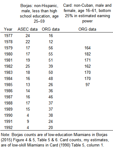
Because of the larger samples, analysis based on the ORG data seems more reliable. In addition, since the ORG survey asks about earnings last week rather than last year, it may be more accurate; on the other hand, weekly data can be noisier since some people’s earnings vary substantially week-to-week. Notably, the more dramatic results in the Borjas paper come from the smaller ASEC samples.
Whether to include women
Card includes women in his analysis. Borjas does not. Among the many differences between the two, this one matters. Borjas explains his focus this way:
It is tempting to increase sample size by including working women, but female labor force participation was increasing very rapidly in the 1980s, so that wage trends are likely to be affected by the selection that obviously marks women’s entry into the labor market.
I am not sure what this means. The idea seems to be that forces unrelated to the Cuban influx were driving trends in women’s earnings, and these could mask the effect of that influx. [Update, October 21: an email from Borjas appears to confirm this reading.] But similar things might be said for low-education men, whose earnings would have been influenced by broad events such as recessions and de-industrialization. Analytical devices such as benchmarking against control groups and focussing on changes immediately after the immigration influx should seemingly work as well for women as for men.
If Borjas excludes women precisely because he knows in advance that their wage trend contradicts the pattern he is looking for, who is engaging in biased selection?
It seems to me that Borjas’s methods will work as well or poorly for both genders, and that both merit attention.
Sudden or gradual changes?
A third difference is that while Card reports annual figures, Borjas groups data into longer periods, in various ways. His graphs show three–year moving averages. Some regressions (Borjas, Tables 5 & 6) compare 1977–79 to 1981–83 and subsequent three-year periods. Others combine 1981–86 into a single “short-run” post-boatlift period.
Combining multiple years of data makes it hard to discern if wages for low-education people dropped suddenly right after the boatlift, or not until a couple of years later, or merely continued a gradual decline.
Put otherwise, Borjas appears readier than Card (or me) to attribute changes 3–5 years after the boatlift to the boatlift. I am unready because many forces buffeted the Miami economy circa 1980–an oil shock, extreme interest rates, two recessions, an influx of narcodollars, and a debt crisis in Latin America. To be fair, they affected cities in the control group too, but perhaps not equally. A relative wage drop 3–5 years after the boatlift seems to admit many explanations.
Fresh plots
To pierce the confusion, I made some graphs. They are designed to closely parallel Borjas’s statistical analysis—the samples, the control group, the control variables, the formulas for variables such as earnings—while breaking out the data by year.
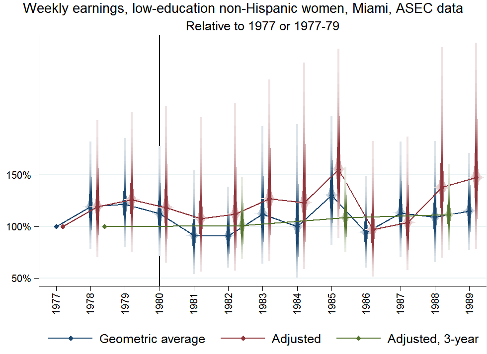
The first one plots the evolution of inflation-adjusted earnings for the group in the crosshairs of Borjas’s microscope: low-education, non-Hispanic, male Miami workers aged 25–59. The data come from the ASEC survey, which, recall, yields some 20 data points a year circa 1980. (More explanation below the graph. Click or tap it for a larger version.)
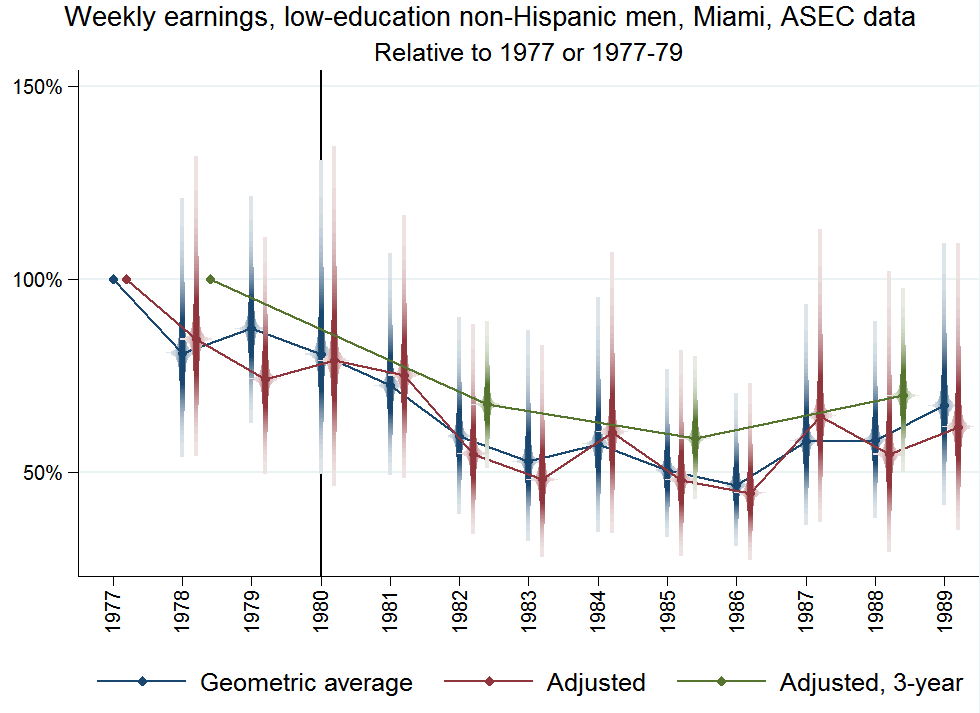
In blue are average inflation-adjusted annual earnings for these Miami workers, expressed relative to the levels in the study’s start year, 1977.[3] So a value for some year of 75% means a 25% fall since the start. The smeared blue diamonds depict the 95% confidence ranges for these averages; this novel rendition is meant to remind you that probability is not spread uniformly within those ranges, but concentrated near their centers. (David Sparks invented this rendition. Ben Jann brings it to life with his awesome coefplot.)
The graph makes it look likely that earnings in this demographic fell between the late 1970s and the early 1980s.
In red, in the same graph, are average wages after adjusting for the evolving the age composition of the group and systematic differences in earnings growth or decline across cities, as well as benchmarking against a Borjas-favored comparison group (Anaheim, Rochester, Nassau-Suffolk, and San Jose).[4] All of these adjustments mimic the Borjas analysis. The cities in the Borjas comparison group look peculiar as a collective benchmark for Miami, but were chosen because they most nearly matched Miami’s 1977–80 employment growth rate of 15.3% (Borjas, Table 3).
At any rate, these adjustments make little difference. The red diamonds—shifted right of the blue ones for legibility—also show a wage decline from the late 1970s to the early 1980s, with an especially big drop in 1982.
Last, the green diamonds show the result of grouping data into three year-periods, again in order to copy Borjas (Borjas, Table 5 & 6). Comparing green dots, wages were clearly lower in 1981–83 than in 1977–79.
Borjas too makes graphs from ASEC data; they show earnings for low-education men in Miami nosediving in the 1980s. I see two problems with those graphs. First, as I mentioned, they plot three-year moving averages, which obscure the timing of the declines in a context where timing is of the essence. Second, unlike the graph above, Brojas’s graphs include no confidence intervals, so they convey false certainty to the untrained eye.
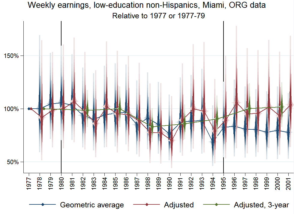
My next graph switches to the more plentiful ORG data set and exploits its coverage to carry forward to 2001, the last year in the Borjas computer code.[5] A second vertical line is added for the 1994–95 migration surge:
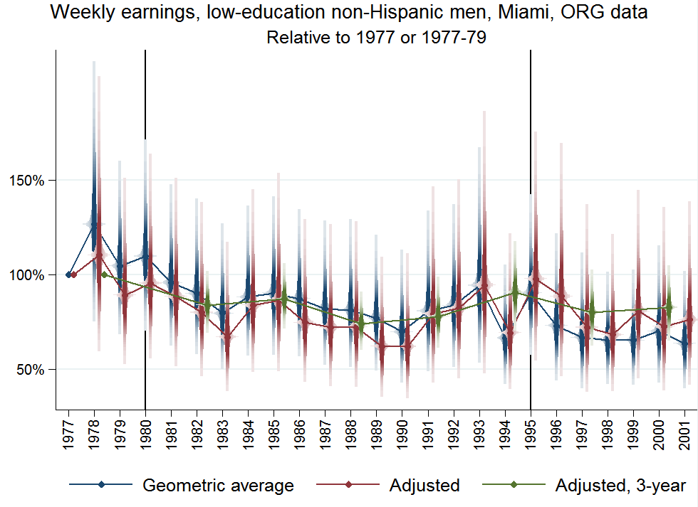
The decline circa 1980 is still visible. But it looks a bit milder now. The trough in 1983 no longer approaches the 50%-drop line. And this flattening parallels Borjas’s statistical results, which are milder for ORG data (Borjas, Table 5, row 1, vs. Table 6, row 1).
Nevertheless, Borjas’s finding of a wage decline after the 1980 boatlift still looks reasonable, if read literally.
But I find it hard, viewing these graphs, to confidently attribute that fall to some shock in 1980. The decline appears gradual and long-term. Neither graph displays a sharp, statistically significant drop immediately after the boatlift.
And switching to women reveals an opposite pattern. Their earnings rose after immigration surges:
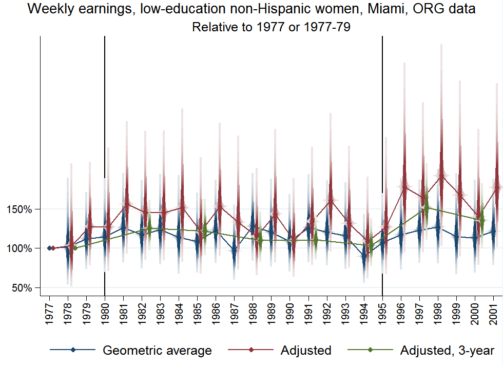
(In contrast, the corresponding graph with ASEC data still shows a slight, statistically insignificant drop among women in 1981.)
Not surprisingly, combining the falling men and rising women smooths things out:
(And here’s the corresponding graph from ASEC data.)
Notice that in 1977–82, the blue diamonds for average wages are statistically indistinguishable, as are the red ones for the adjusted means. It is only in 1983 that a larger drop emerges, and even it is transient, indistinguishable from noise. Meanwhile, wages rise, if anything, after the 1994–95 immigration surge.
I believe these graphs provide a clearer picture than the Borjas paper of the underlying data. They do not make a compelling case for harmful side effects of immigration.
Code and data replicating Borjas, Card, and my own analysis are here. Also included is a larger set of graphs generated by that code, covering hourly wages, employment, and unemployment.
All this graphical analysis is a bit loose, but the graphs come from formal regressions, numerical results from which are in two tables. These check whether annual and hourly wages and, in the ORG data, employment and unemployment changed significantly in Miami from 1980 to 1981, 1982, or 1983, as well as from 1977–79 to 1981–83. They show changes with little significance by 1981 but more significance by 1982.
Possibly the Mariel boatlift did swamp the Miami labor market, but with a two-year delay. But these results are also consistent with the continuation of long-term trends in Miami. I see no strong basis for implicating immigration.
Perhaps I interpret the data differently because of a difference in priors. If I assume that immigration is a potentially leading force in labor markets, then I may be ready to blame the 1980 boatlift for the exceptional wage drop in Miami in the late 1980s, depicted above. But that comes close to assuming the conclusion. If I instead come to the data with more skepticism, mindful that many idiosyncratic forces impinge upon local labor markets, then graphs like that will not change my mind. Only a sharp drop soon after the boatlift would force me to reconsider.
In its favor, Borjas’s work has accentuated my appreciation of the limitations of Card’s study. Even when looking short-term, over a year or so after a major immigration flow, many factors may disturb labor markets enough to obscure the effects of immigration. There is a lot of noise in the data. The appearance of no real effect is not conclusive.
But my previous, terse summary still reads about right to me: “Natural experiment not as perfect as randomized since other events could have offset Boatlift’s effects. But zero change after 7% labor supply spike most easily explained as (non-)impact.” More broadly, the overall impact of immigration on workers in the receiving country looks modestly negative at worst, with the most vulnerable group being recent immigrants. And there is little doubt that migrants from poor countries as a group gain immensely by migrating.
Notes
[1] Thus, as Borjas points out, “The Mariel Boatlift That Did Not Happen” actually did happen. For clarification of that cryptic statement, see my discussion of Card (1990).
[2] Unemployment is the fraction of those in the labor force—defined as those who have or want work—who are not working. Employment is the fraction of working-age adults who are working.
[3] Results come from a regression of log inflation-adjusted annual earnings, expressed per week worked, on year dummies. Results are exponentiated for presentation, producing geometric averages. Copying Borjas, the sample is male, non-hispanic workers aged 25–59; “top-coded” earnings are multiplied by 1.5; those with hourly wages below $1.50 or above $40 in 1980 dollars are excluded; Census Bureau–supplied weights are incorporated; and standard errors are heteroskedasticity-robust.
[4] Regressions are the same as before, but now including dummies for years, the four control cities, and 5-year age groups.
[5] The dependent variable is the log of last week’s earnings. Following Borjas, the sample is male, non-hispanic workers aged 25–59; “top-coded” earnings are multiplied by 1.5; and those with hourly wages below $1.50 or above $40 in 1980 dollars are excluded.
Comments
Has nobody in the history of the economics profession remembered what was happening in Miami to boost wages locally in the years immediately following the Mariel Boatlift of 1980? Has no economist ever watched “Miami Vice,” “Scarface,” or the new Netflix series “Narcos?” Ceteris was very much not paribus in Miami in the early 1980s due to the most famous Cocaine Boom in history.
I did just read about how Marco Rubio’s brother-in-law was a drug dealer. But I don’t see how anecdotal evidence like that or fiction would help me assess the impact of the Mariel boatlift on wages in Miami.
Comments are closed.