This is the final post (of six) we have made focused on our self-evaluation and future plans.
This post lays out highlights from our metrics report for 2013. For more detail, see our full metrics report (PDF).
1. In 2013, GiveWell tracked $17.36 million in money moved to our top charities, and an additional $0.90 million to recommendations made as a part of work on GiveWell Labs. This is a significant increase over past years.
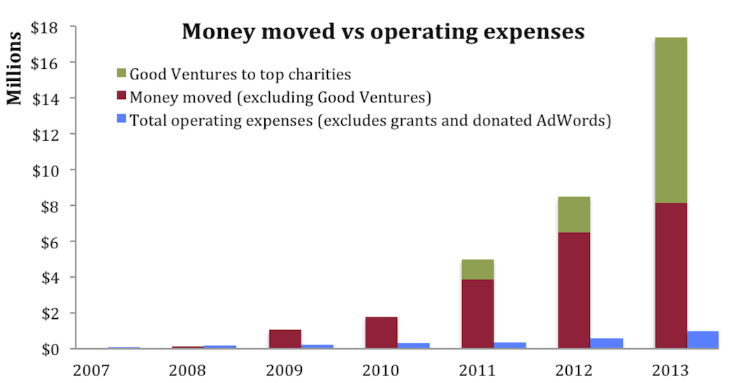
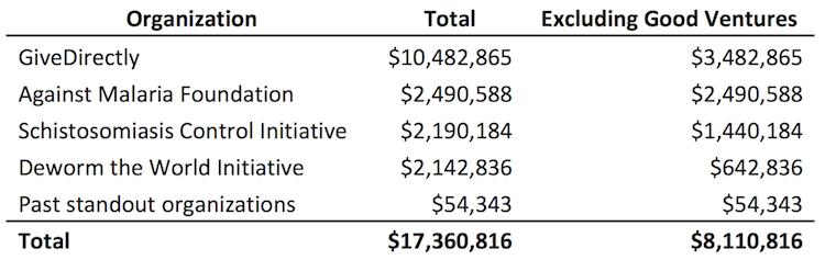
2. GiveDirectly received about 60% of the money moved and our other top charities, Against Malaria Foundation, Schistosomiasis Control Initiative, and Deworm the World Initiative, each received 12-14%. Funding for GiveDirectly was driven in part by $5 million in matching funds from Good Ventures.

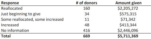
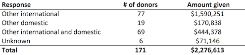
4. Money moved by donors giving more than $10,000 fell (by 9%), and fell substantially for those giving more than $50,000 (by 41%). To explain why, we reviewed each $50k+ donor’s situation individually and categorized them based on what we know about their giving decisions in 2013. Overall giving by these donors fell about $1 million. Most of the decrease among these donors was due to donors who decided to wait to give, thinking that giving options could be better in the next few years.
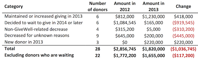
Overall, we believe the decrease in money moved from large donors is likely to be temporary and is not a reflection of decreased interest in GiveWell. More in our full metrics report.
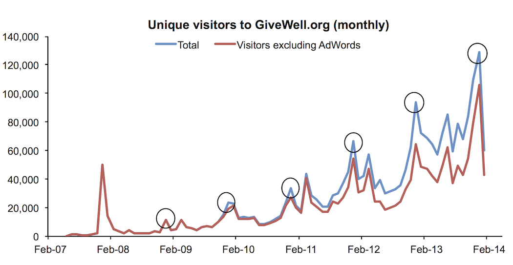
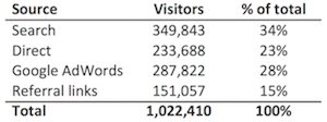
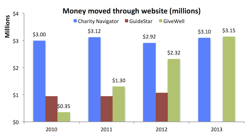
5. Web traffic continued to grow. Growth in search, direct, Google AdWords, and referral link traffic all contributed to overall growth. Traffic tends to peak in December of each year, circled in the chart below.
What effect has GiveWell had on your giving?
Comments
I know its common to plot money vs time as a bar chart, but I think #1 and #8 of those money vs time graphs would look better as line plots.
It would be interesting to see a log(money) vs time plot.
#3 would be much better as a pair of line plots covering the last couple years rather than a table.
In #6, age vs amount donated should also be a line plot.
Congratulations on passing Charity Navigator! Its great to see you guys growing so much and I love the transparency!
jsalvatier –
Thanks for the suggestions and kind words. We’ve posted the data used in the report in this spreadsheet so that anyone who is interested can create other ways of presenting this information. We encourage anyone who does to post a link here in the comments.
Thank you. Is it possible to make a food donation instead of money? In if the answer is yes, what is the process?
Very excited to read about the continuing growth, and looking forward to seeing the progress in 2014 – thanks for posting.
Quick question: when you ask donors “What effect has GiveWell had on your giving?”, do you allow for a “decreased” response in your response coding? I’m not sure how this question is formulated, and I wouldn’t expect GiveWell to have a negative effect on the amount donated, but it seems to me that it would still be important to measure this if you’re not doing so already.
Daniel –
Yes, one of the available responses for the survey question “How would your giving have been different in GiveWell’s absence?” was “Would have given significantly more.” None of the respondents selected this option.
The full survey is available here.
Comments are closed.