Summary
- Two of GiveWell’s top charities fight malaria in sub-Saharan Africa.
- GiveWell’s valuations of these charities place some weight on research by Hoyt Bleakley on the impacts of malaria eradication efforts in the American South in the 1920s and in Brazil, Colombia, and Mexico in the 1950s.
- I reviewed the Bleakley study and mostly support its key findings: the campaigns to eradicate malaria from Brazil, Colombia, and Mexico, and perhaps the American South as well, were followed by accelerated income gains for people whose childhood exposure to the disease was reduced. The timing of these events is compatible with the theory that rolling back malaria increased prosperity. Full write-up here.
Introduction
I blogged three weeks ago about having reviewed and reanalyzed Hoyt Bleakley’s study of the effort in the 1910s to rid the American South of hookworm disease (not malaria). That study, published in 2007, seems to show that the children who benefited from the campaign attended school more and went on to earn more as adults.
For GiveWell, Bleakley’s 2010 study is to malaria parasites as his 2007 study is to intestinal worms. Like the 2007 paper, the 2010 one looks back at large-scale, 20th-century eradication campaigns in order to estimate impacts on schooling and adult income. It too produces encouraging results. And it has influenced GiveWell’s recommendations of certain charities—the Against Malaria Foundation and Malaria Consortium’s seasonal malaria chemoprevention program.
Because GiveWell had already invested in replicating and reanalyzing Bleakley (2007), and because the two papers overlap in data and method, I decided to do the same for Bleakley (2010). And here the parallel between the two papers breaks down: having run the evidence through my analytical sieve, my confidence that eradicating malaria boosted income is substantially higher than my confidence that eradicating hookworm did. I’m a bit less sure that it did so in the United States than in Brazil, Colombia, and Mexico; but the Latin American experience is probably more relevant for the places in which our recommended charities work.
This post will walk through the results. For details, see the new working paper. Because my malaria reanalysis shares so much with the hookworm one, I have written this post as if you read the last one. If you haven’t, please do that now.
How the malaria analysis differs from the hookworm one
Having just emphasized the commonality between Bleakley’s hookworm and malaria eradication studies—and my reanalyses thereof—in order to orient you, I should explain how the two differ:
- The hookworm study is set exclusively in the American South, while the malaria study looks at efforts in four countries. In the United States in the 1920s, no doubt inspired by the previous decade’s success against hookworm, the Rockefeller Foundation and the U.S. Public Health Service promoted a large-scale program to drain swamps and spray larvicides, which cut malaria mortality in the South by 60%. Then in the 1950s, with the discovery of DDT, the World Health Organization led a worldwide campaign against the disease. Partly because of data availability, Bleakley (2010) studies the consequences in Brazil, Colombia, and Mexico.1Bleakley (2010) also chose these countries because they had malarial and non-malarial regions, allowing comparisons. See Bleakley (2010), note 6. For sample maps see this.
- Where the hookworm study groups data two ways—first by place of residence to study short-term effects, then by place of birth to study long-term effects—the malaria study does only the latter.
- I pre-registered my analysis plan for the malaria study with the Open Science Framework and hewed to it. While I did not allow the plan to bind my actions, it serves to disclose which analytical tactics I settled on before I touched the data and could know what results they would produce.2Actually we registered a plan for the hookworm study too, but the malaria plan was better informed—and better followed—precisely because it came on the heels of the similar hookworm reanalysis. For brevity, I skipped this theme in my blog post. I did write about it in the hookworm working paper.
- The Bleakley malaria paper appeared in a journal published by the American Economic Association (AEA), which requires its authors to post data and computer code on the AEA website. This aided replication and reanalysis. Unfortunately, as appears to be the norm among AEA journals, the Bleakley (2010) data and code only reproduce the paper’s tables, not the graphs that in this case I see as central.
- For Brazil, Colombia, and Mexico, I mostly relied on that publicly posted data for the crucial information on which regions within a country had the most malaria, rather than trying to construct those variables from old maps and books in Spanish and Portuguese. I also relied on the public data for geographic control variables. I think it can be valuable to go back to primary sources, but for the time being at least, this step looked too time-consuming. I did update and expand the Latin outcome data, on such things as literacy and income, because it is already conveniently digitized in IPUMS International. And I reconstructed all the U.S. data from primary sources, simply by copying what we assembled for the hookworm reanalysis.
Results
In showing you what I found, I’ll follow nearly the same narrative as in my previous post’s section on the “long-term impact on earnings.” To start, here is a key graph from the Bleakley (2010) paper—or really four graphs. In each country’s graph, as with the hookworm graphs, each dot shows the association between historical disease burden in a state (or municipio) and the average income in adulthood of people born there in a given year. In all but Colombia, the leftmost dots line up with the negative range on the vertical axis, meaning that, initially, coming from a historically malarial area stunted one’s income. For example, some of the early U.S. dots are around –0.1 on the vertical axis, which means that being native to swampy Mississippi instead of arid Wyoming cut one’s adult earnings by about 10%.3For cross-country comparability, Bleakley (2010) normalizes the malaria mortality and ecology indexes so that the 5th- and 95th-percentile geographic units—Wyoming and Mississippi in the U.S. case—score 0 and 1. Income proxies are taken in logs. The dots later rise, suggesting that the liability of coming from malarial areas faded, and even reversed. In Colombia, the dots start around zero but also then rise.
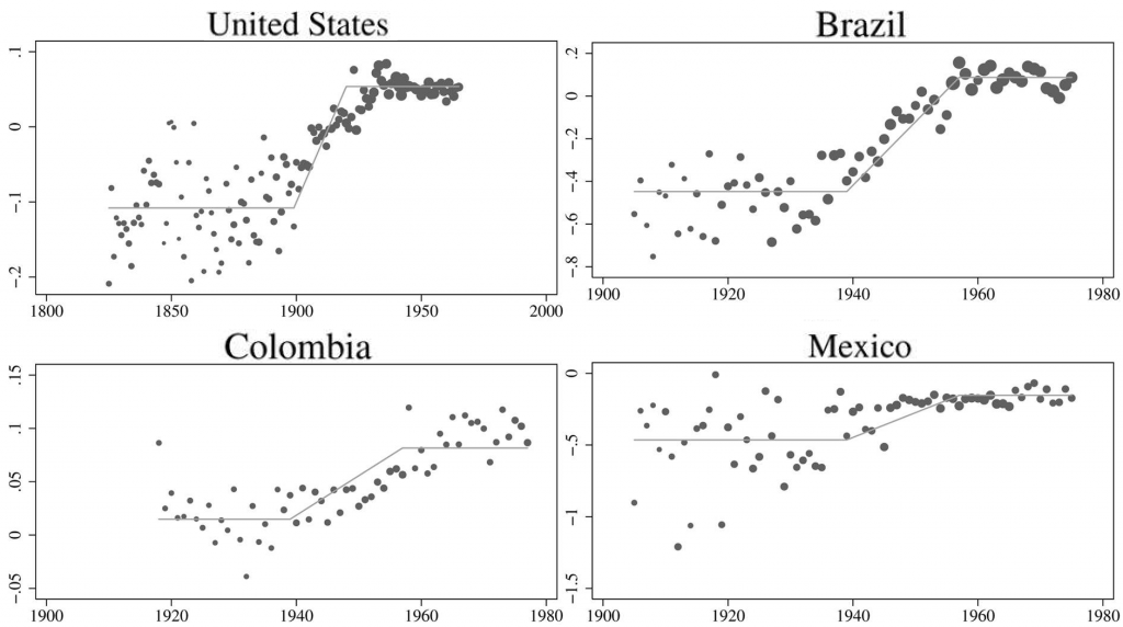
As in the hookworm study, here, Bleakley (2010) superimposes on the dots the step-like contour representing how malaria eradication is expected to play out in the data. The steps reach their full height when the campaigns are taken to have started—1920 in the United States and 1957 in the Latin nations. All babies born after these points were alike in that they grew up fully in the post–eradication campaign world. The step contours begin their rises 18 years earlier, when the first babies were born who would benefit from eradication at least a bit by their 18th birthdays.4These graphs incorporate all of Bleakley’s control variables. In my hookworm post, I began both results sections with “basic” graphs that did not include all the controls, imitating Bleakley (2007). In contrast, all the Bleakley (2010) graphs incorporate full controls. So I do the same.
Next is my closest replication of the key Bleakley (2010) graphs. These use Bleakley’s data, as posted, but not Bleakley’s computer code, since that was not posted:

The next version adds the latest rounds of census data from the Latin nations and the newer, larger samples from old census rounds for the United States. It also redefines childhood as lasting 21 instead of 18 years, because I discovered that the Bleakley (2010) code uses 18 but the text uses 21. That budges the first dashed lines back by three years:
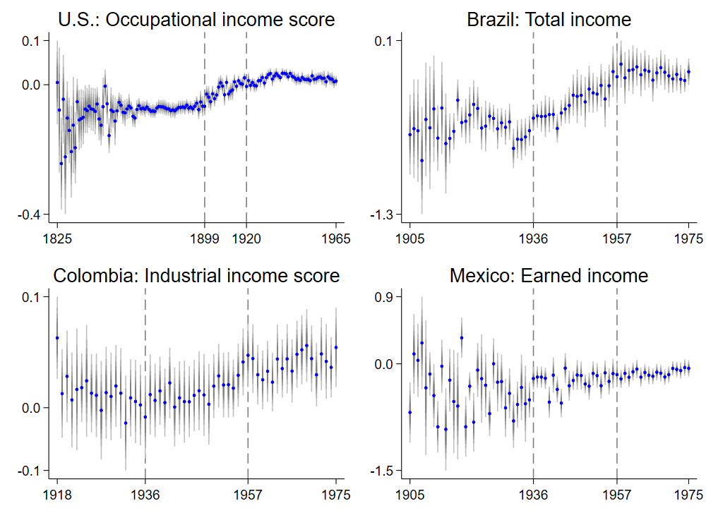
I avoided superimposing step contours on these data points because I worried that it would trick the brain into thinking that the contours fit the data better than they do. But whether the step contour fits the plots above is exactly what you should ask yourself now. Does it seem as if the dots rise, or rise more, between each pair of vertical, dashed lines? I could see the answer being “yes” for all but Mexico. And that could be a fingerprint of malaria eradication.
I ask that question more formally in the next quartet, fitting line segments to successive ranges of the data. The dots in the four graphs are the same as above, but I’ve taken away the grey confidence intervals for readability. The p values in the lower-left of each pane speak to whether any upward or downward bends at the allowed kink points are statistically significant, i.e., hard to ascribe to chance alone. Where the p values are low—and they mostly are, even in Mexico—they favor the Bleakley (2010) reading that rolling back malaria raised incomes.
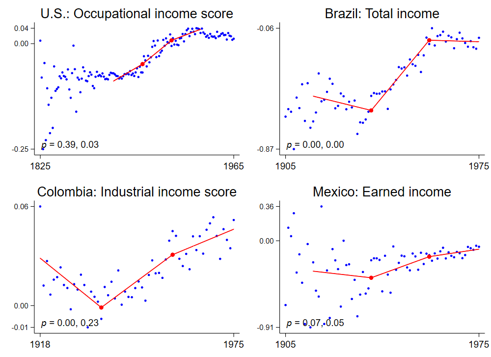
In Brazil, Colombia, and Mexico, this statistical test is fairly confident that red lines bend upward at the first kinks (p = 0.00 for Brazil and Colombia and 0.07 for Mexico). That is: in high-malaria areas, relative to low-malaria areas, as the first babies were born who could benefit in childhood from eradication, future incomes rose. The test is less confident for the United States, where the first allowed kink, in 1899, gets a high-ish p value of 0.39. However, the U.S. trend clearly bends upward—just earlier than predicted by the Bleakley (2010) theory. That might mean that the Bleakley (2010) theory is slightly wrong: maybe when it came to impacts on future earnings, malaria exposure continued to matter into one’s twenties, at least in the United States 100 years ago. Then, people born in the South even a bit before 1899 (the date of the first U.S. kink point) would have benefited from the eventual campaign against malaria; and that first kink should be moved to the left, where it would match the data better and produce a lower p value. Or perhaps that high p value of 0.39 signifies that the Bleakley (2010) model is completely wrong for the United States, and that forces other than malaria eradication drove the South’s catch-up on income.
Now, in addition to the four measures of income studied above–one for each country—the Bleakley (2010) paper looks at eight other outcomes. Six are literacy and years of schooling completed, tracked separately in Brazil, Colombia, and Mexico. In addition, there is, for Brazil, earned income—as distinct from total income (“earned” meaning earned through work). And there is, for the United States, Duncan’s Socioeconomic Index (SEI), which blends the occupational income score, explained in my last post, with information about a person’s education level. Your Duncan’s SEI is highest if you hold what is typically a high-paying job (as with the occupational income score) and you have a lot of education.
The first public version of the Bleakley study makes graphs for the additional eight outcomes too. But the final, journal-published version drops them, perhaps to save space. Since for me, the graphs are so central, I generated my own graphs for the other eight outcomes:
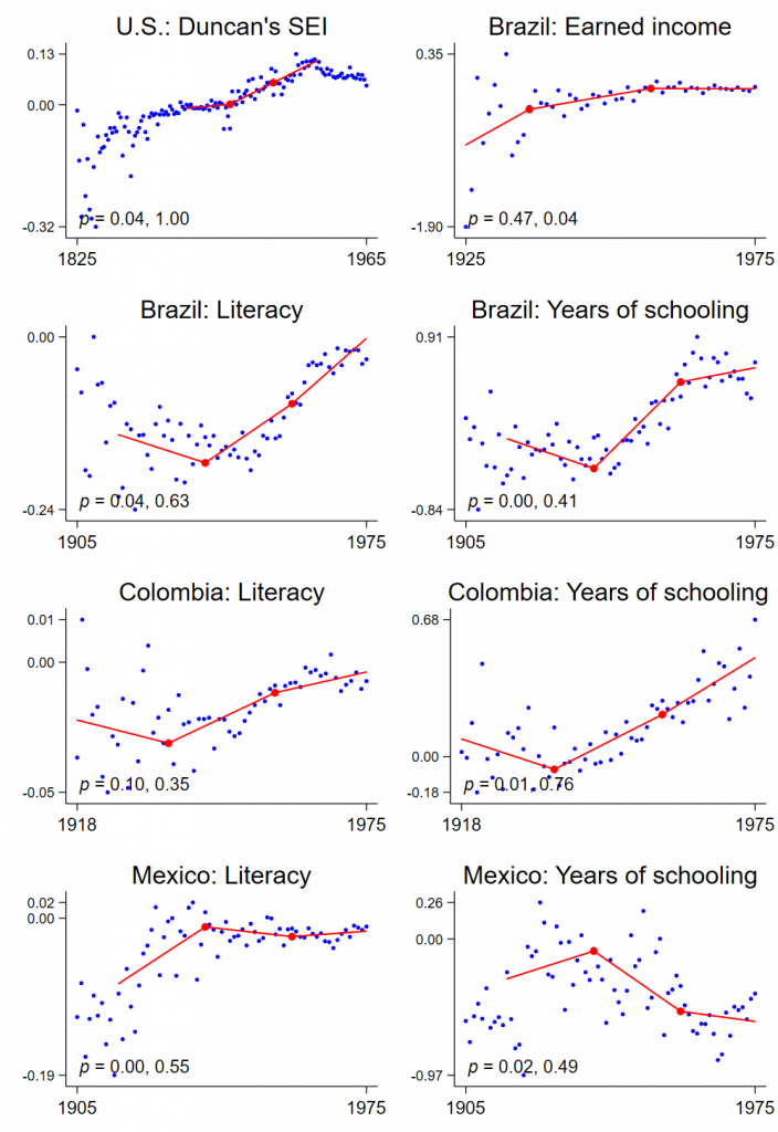
These figures hand us a mixed bag. In the United States, the trend on Duncan’s index appears to bend as predicted at the first allowed kink (p = 0.04) but not the second. Seemingly, relative income gains continued in the South well after malaria eradication could cause them. In Brazil, while relative progress on earned income slows when expected (second kink, p = 0.04), it does not appear to accelerate when expected (first kink), perhaps owing to small samples in the early years. In none of the Latin countries does relative progress on adult literacy or years of schooling slow with much statistical significance at the expected time (second kink points in bottom six graphs). The trend bends in all six at the first kink point, and with statistical significance—but the wrong way in Mexico.
In fact, the mixed bag partly corroborates Bleakley (2010), which also questions whether rolling back malaria increased schooling. The new results depart from Bleakley (2010) in also questioning the benefit for literacy. And they cast some doubt on the income impact in the United States. In both the U.S. plots—in the upper-left of the last two sets of graphs above—it’s clear that the income gap between the South and the rest narrowed over many decades. It’s less clear that it did so with a rhythm attributable to the malaria eradication effort of the 1920s.
Conclusion
For me, this reanalysis triggers a modest update to my understanding of the impacts of malaria prevention. With regard to adult income in Latin America, and perhaps the United States, the Bleakley (2010) theory withstands reexamination. It holds up less well for literacy, but this is not very surprising given that Bleakley (2010) also did not find clear impacts on schooling.
I wouldn’t say that my confirmation proves that malaria eradication campaigns in the Americas boosted income in the way that a large-scale randomized study might. But then neither, if you read him closely, does Bleakley. Rather, the evidence “indicates” impact. The theory that malaria eradication in the Americas increased earnings fits pretty well to the data we have. And that is probably about as much certainty as we can expect from this historical analysis.
Much of the data and code for this study are here (2 GB). Because of IPUMS licensing limitations, the download leaves out the census data for Brazil, Colombia, and Mexico. The included “read me” file explains how to obtain this data. The full write-up is here.
Notes
| ↑1 | Bleakley (2010) also chose these countries because they had malarial and non-malarial regions, allowing comparisons. See Bleakley (2010), note 6. For sample maps see this. |
|---|---|
| ↑2 | Actually we registered a plan for the hookworm study too, but the malaria plan was better informed—and better followed—precisely because it came on the heels of the similar hookworm reanalysis. For brevity, I skipped this theme in my blog post. I did write about it in the hookworm working paper. |
| ↑3 | For cross-country comparability, Bleakley (2010) normalizes the malaria mortality and ecology indexes so that the 5th- and 95th-percentile geographic units—Wyoming and Mississippi in the U.S. case—score 0 and 1. Income proxies are taken in logs. |
| ↑4 | These graphs incorporate all of Bleakley’s control variables. In my hookworm post, I began both results sections with “basic” graphs that did not include all the controls, imitating Bleakley (2007). In contrast, all the Bleakley (2010) graphs incorporate full controls. So I do the same. |